I was poking around with a design in the style of the old cassette inserts that CBS Records Australia Ltd put out in the late 70s and early 80s. The album cover would either be truncated, or shrunken so it kept its square aspect and the artist and album name typeset around it. For instance, here’s the insert of the third cassette I ever bought as a nerdy teenager, Hergest Ridge.
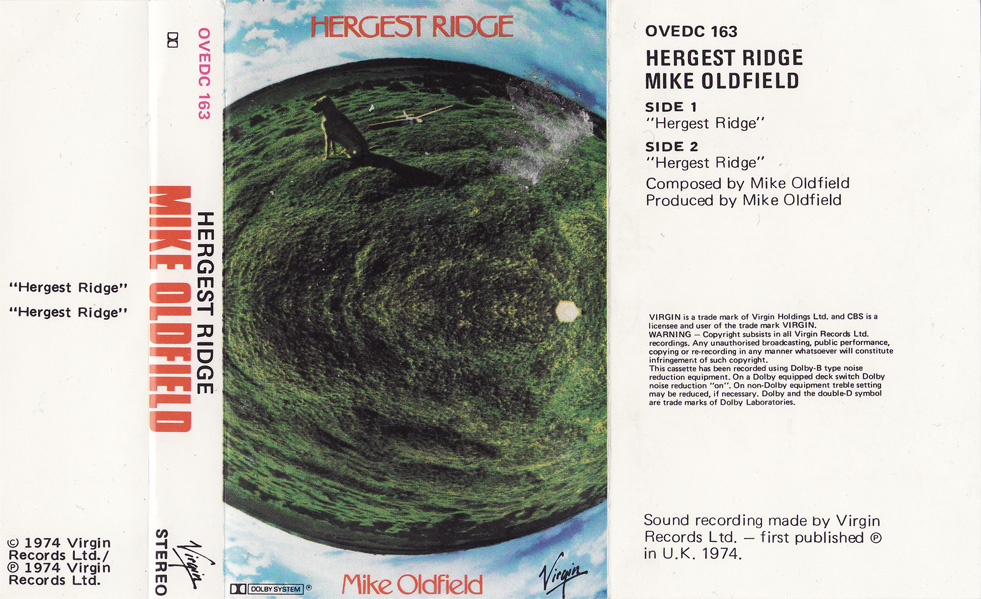
Finding matching fonts for the spine wasn’t so hard, the big red artist name is set in Compacta Bold or a similar bold, condensed font – a lot of CBS cassettes also used Machine – and the smaller type is set in a particular cut of Univers. But the track listing on the flap on the left? At first it was a complete mystery. What sort of font was it? Superficially, it was a grotesque or gothic of some kind. It was not Trade Gothic or News Gothic, however, but familiar in its own way – I vaguely recall it being used for newspaper classifieds in newspapers through the 80s.
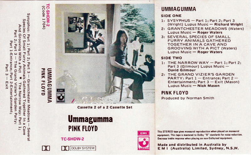
Most of my old pre-recorded tapes are probably still kicking around somewhere (once I went digital I never went back) so I did a search online for more tape covers with in this font. I came across a pretty good example, an Australian print of Pink Floyd’s Ummagumma, which gave me enough distinct letters for a couple of popular font matching sites, Identifont and MyFonts’ What the Font service, but I got no decent matches from either.
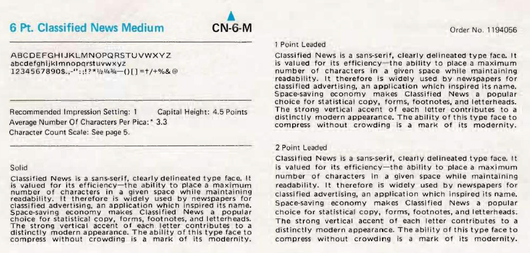
So what next? Trawling around, I figured out pretty quickly that the same font was used on a lot of vinyl labels, usually for the track list, just like on the cassettes. If you’ve got any old vinyl from the 70s you’ll probably find it. And on collector sites, particularly for old Beatles releases, the fonts on labels were one of the ways collectors identified particular pressings. By this arse-backwards search, I had a name for the font, as well as a vendor – “IBM Classified News”.
The name fit its purpose well, but as a result searching for it was problematic, unless I added other keywords, otherwise I’d just end up looking at classified ads on news sites. The “IBM” bit let me narrow it down, and what that was actually referred to was the old IBM Selectric typewriters – in particular, the IBM Selectric Composer typesetting machine.
Ding! End of the line.
Most typewriters only worked with monospace type, even the base IBM Selectric model, but this had the feature that typefaces could be changed on the fly by swapping “golfballs”. In comparison, the Composer was a monster, offering a range of proportional type, and could justify text (although on the early models of the Composer you had to type each line twice to get it right!). It was also notoriously tricky to maintain, from what I gather, usually requiring a service contract with the lease. But before the advent of desktop publishing, the Composer was an economical alternative to a full-blown printing press when preparing labels for records. Hence the ubiquity of 6 point Classified News on record labels.
Classified News was just one of a range of proportional fonts, including the Univers variant, which is also prominent on my examples. However, while most of the font selections can be substituted by suitable digital variants, ranging from a Times clone to Pyramid (an Egyptian slab-serif not unlike Rockwell, of course).
Classified News does not. There seems to be no readily available digital version that I can find that comes close to embodying its unique character.
Fortunately, someone has scanned the whole specimen catalogue at a decent resolation, and even used typeballs are available, quite cheaply. So the typeface is not dead – just dormant, as far as the digital space is concerned.
The main issue would be finding a working Selectric Composer for it, although I imagine that it wouldn’t be too difficult to go low-tech and use the typeball with a stamp pad to make an impression for scanning purposes. A direct scan be decent enough, particularly if you’re trying to do the sort of pastiche that started me on this little bit of research. However my desire has moved from just wanting it for a one-off retro gimmick and more towards a proper revival, maintaining the distinctive features and quirks but cleaning it up and making it a little sharper.
I am actually going to have a stab at it myself where it’ll probably end up as another of my badly drawn, badly spaced failures, but I suggest there is a niche for a trained designer to have a serious go at bringing Classified News back into the public eye. It would probably strike a chord with all those New New Romantics who have decided that wonky bits of black plastic are the only “authentic” way to own music, and want the labels to match.